
Add sliding sidebar menu to mobile home page

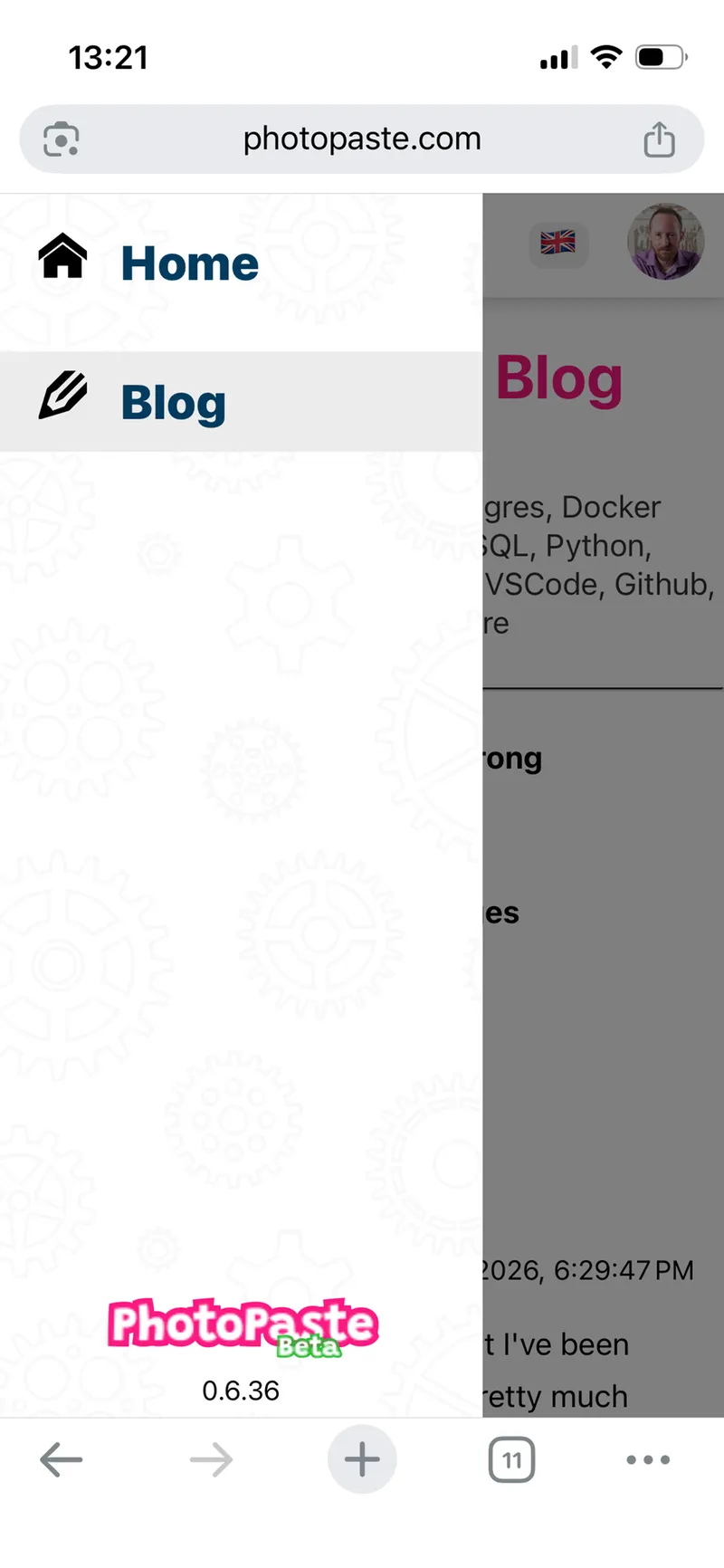
With the addition of the develop blog to the homepage, and with more pages planned, I needed the mobile version of the home page to have a vertical 'hamburger' menu. I've already done a version of this in the mobile event app, so instead of copy/pasting, let's see if we can do this the right way.
The mobile app version:
The original sidebar HTML:
    <div class="sidebar" id="sidebar" [class.open]="showMenu">
        <ul class="main-menu">
            <li><a [routerLink]="['chat']">
                <app-svg-icon name="icon-bubbles4" class="icon"></app-svg-icon>
                {{ 'menu.chat' | translate }}</a></li>
            <li><a [routerLink]="['gallery', 'bydate']">
                <app-svg-icon name="icon-file-picture"
                              class="icon"></app-svg-icon>
                {{ 'menu.photos' | translate }}</a></li>
            <li><a [routerLink]="['gallery', 'random']">
                <app-svg-icon name="icon-shuffle" class="icon"></app-svg-icon>
                {{ 'menu.random' | translate }}</a></li>
...
        </ul>
        <div class="menu-footer">
            @if (logoSrc$ | async) {
                <img [src]="logoSrc$ | async" class="logo" alt="PhotoPaste logo">
            }
            <div class="version">
                {{ frontendVersion }}
            </div>
        </div>
    </div>
I noticed that the menu part was really just a bunch of routerLinks. No complex logic or trickery. This is an opportunity to extract the menu logic, CSS and animations to a separate, generic, component.
The CSS animation is also simple:
.sidebar {
    position: fixed;
    top: 0;
    width: 250px;
    left: -250px;
    ...
    transition: left 0.3s ease;
}

.sidebar.open {
    left: 0;
}
I have briefly looked into the Angular CDK for this, but the controls weren't very good and it took more JS and CSS to undo the defaults than doing it without CDK. Or I haven't looked long enough. Either way I much prefer being in complete control.
So I've extracted the menu into its own component.
<a (click)="showMenu.set(true)" class="menu-icon">☰</a>
<div class="sidebar" id="sidebar" [class.open]="showMenu()">
<ng-content></ng-content>
</div>
<div class="overlay" id="overlay" [class.active]="showMenu()" (click)="showMenu.set(false)"></div>
The logic looks clean:
@Component({
    selector: 'app-sliding-menu',
    imports: [],
    templateUrl: './sliding-menu.html',
    styleUrl: './sliding-menu.css',
})
export class SlidingMenu implements OnInit, OnDestroy {
    router = inject(Router);

    showMenu = signal(false);

    private subGroup = new SubscriptionGroup();

    ngOnInit() {
        this.subGroup.subscribe(this.router.events, event => {
            if (event instanceof NavigationEnd) {
                this.showMenu.set(false);
            }
        });
    }

    ngOnDestroy(): void {
        this.subGroup.unSubscribeAll();
    }

}
And here's how it's used:
        <app-sliding-menu>
            <ul class="side-menu">
                <li routerLinkActive="active" [routerLink]="['/']">Home</li>
                <li routerLinkActive="active" [routerLink]="['/blog']">Blog</li>
            </ul>
        </app-sliding-menu>
Read more articles
- Moving towards Cloud storage
- Add event and user statistics
- Refactor Infrastructure
- Add QR code to mobile
- Video support and Scrolling Menu
- Automatic blog updates with Git Webhooks
- Add sliding sidebar menu to mobile home page
- I've been doing WebFlux wrong
- Implement Blog
- Migrating event urls
- Interesting bug
- Dynamic social media badges
- Improving Games and Teams
- Blue Green deployments
- Why I left the big cloud
- Moving from AWS Amplify to Google Firebase
- First version